The Cremona Circuit brand was in need of a strategic realignment and visual coherence after years of inconsistent use.
My role involved helping the company understand the correct application of their brand and unlocking its true potential.
Strategic and Visual Redesign
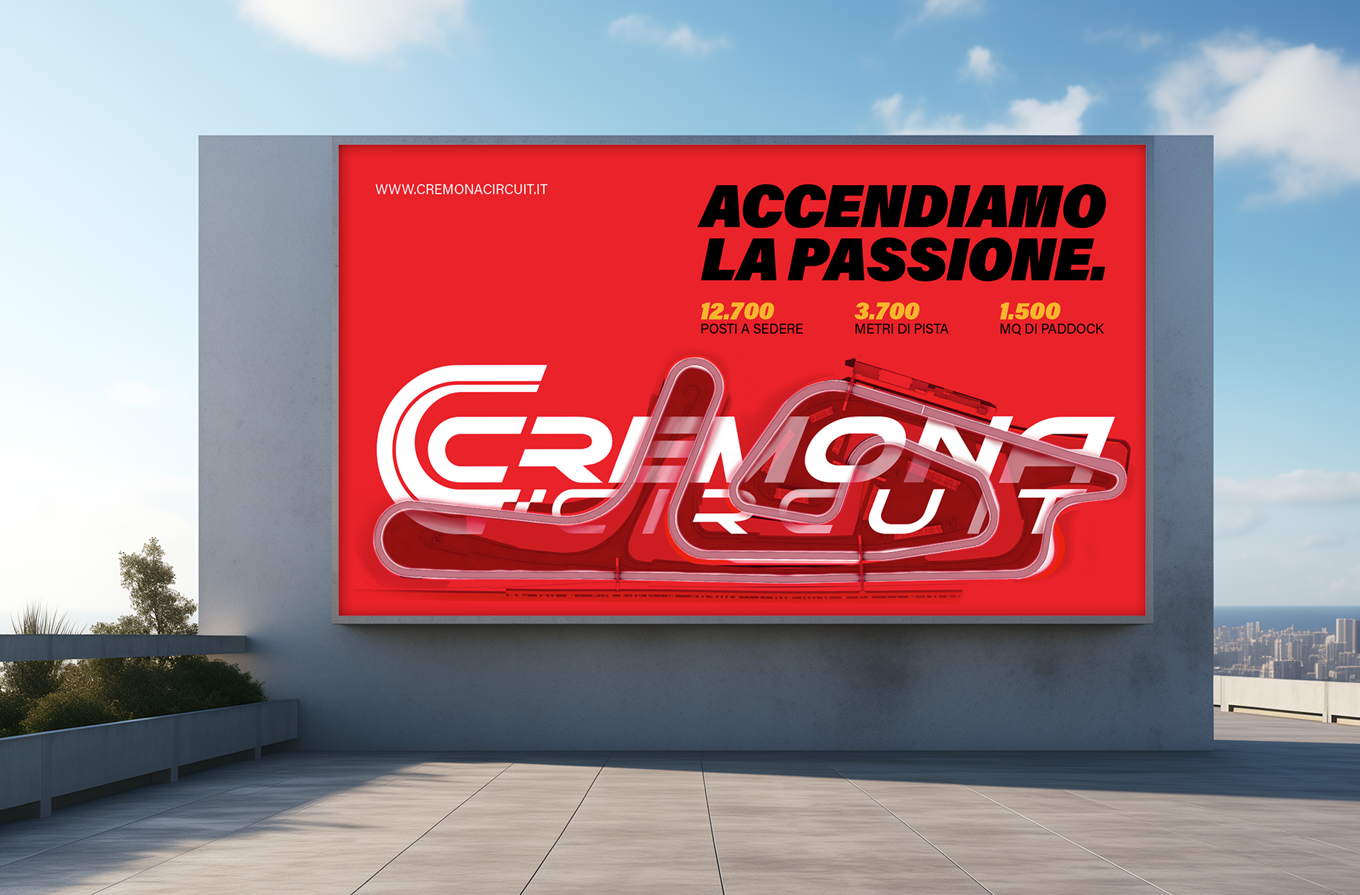
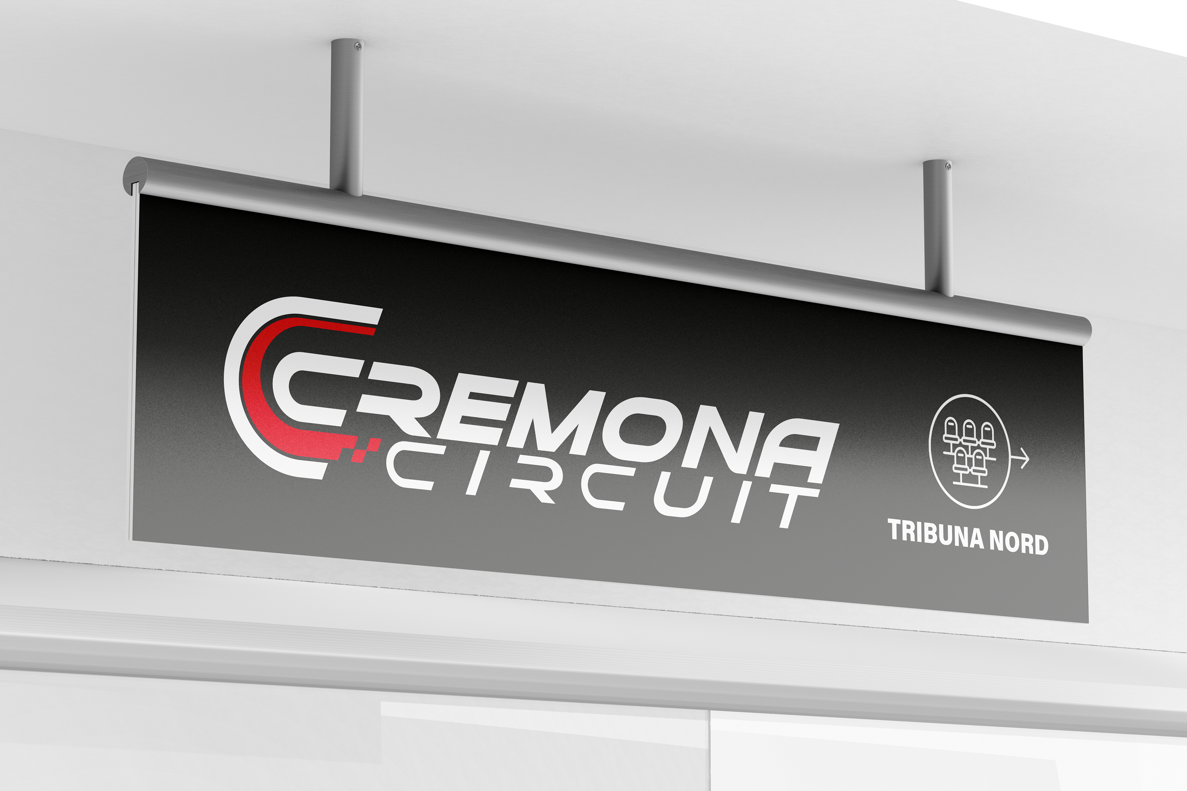
The first banner produced at Cremona Circuit Autodrome
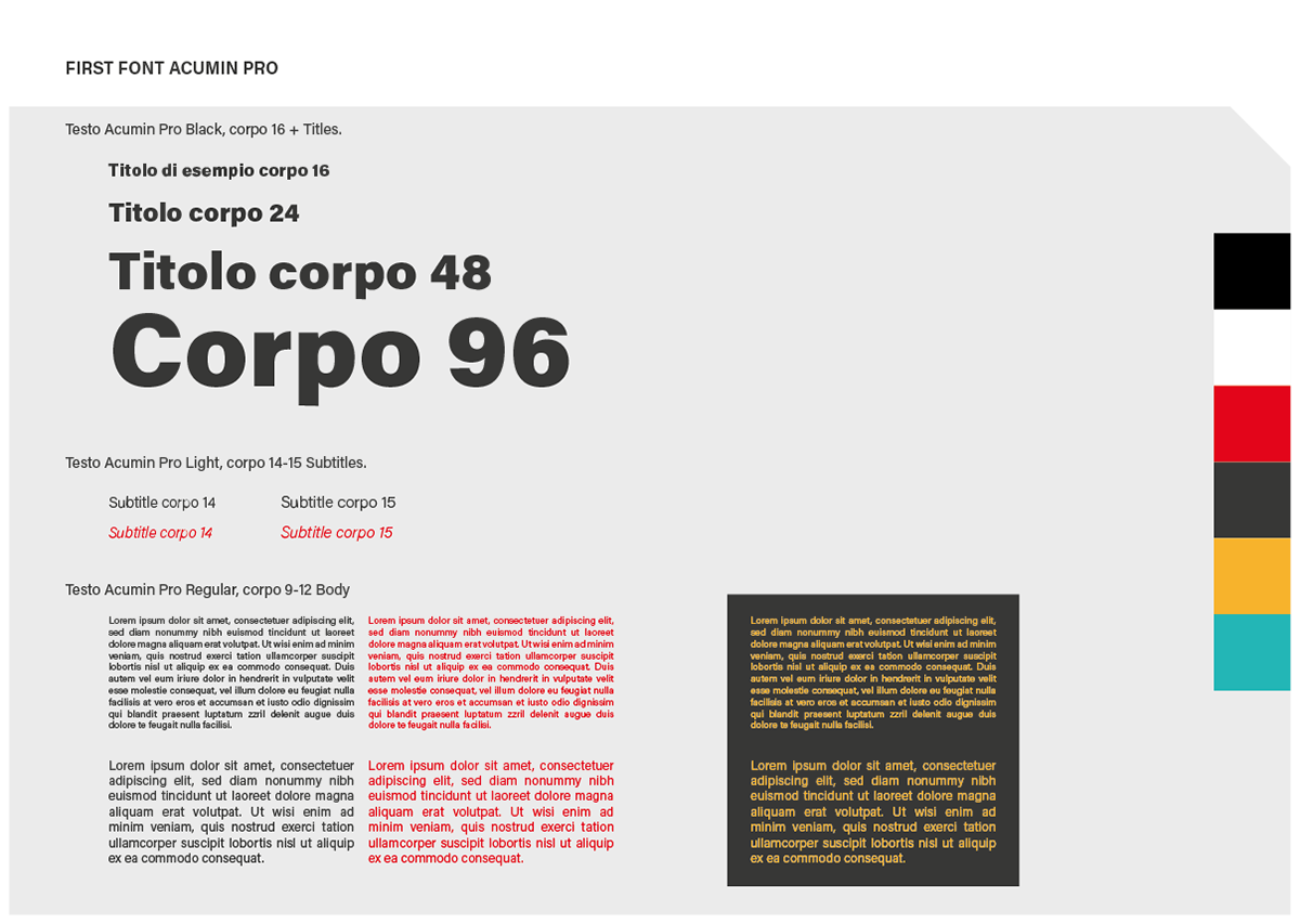
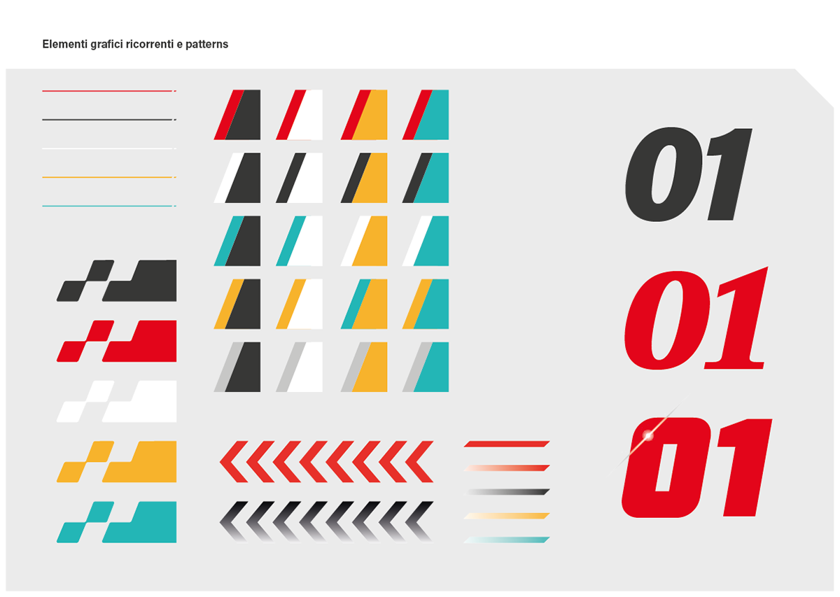
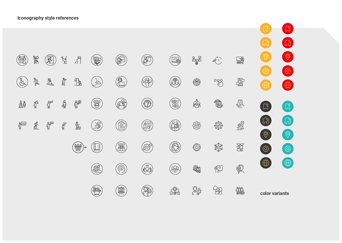
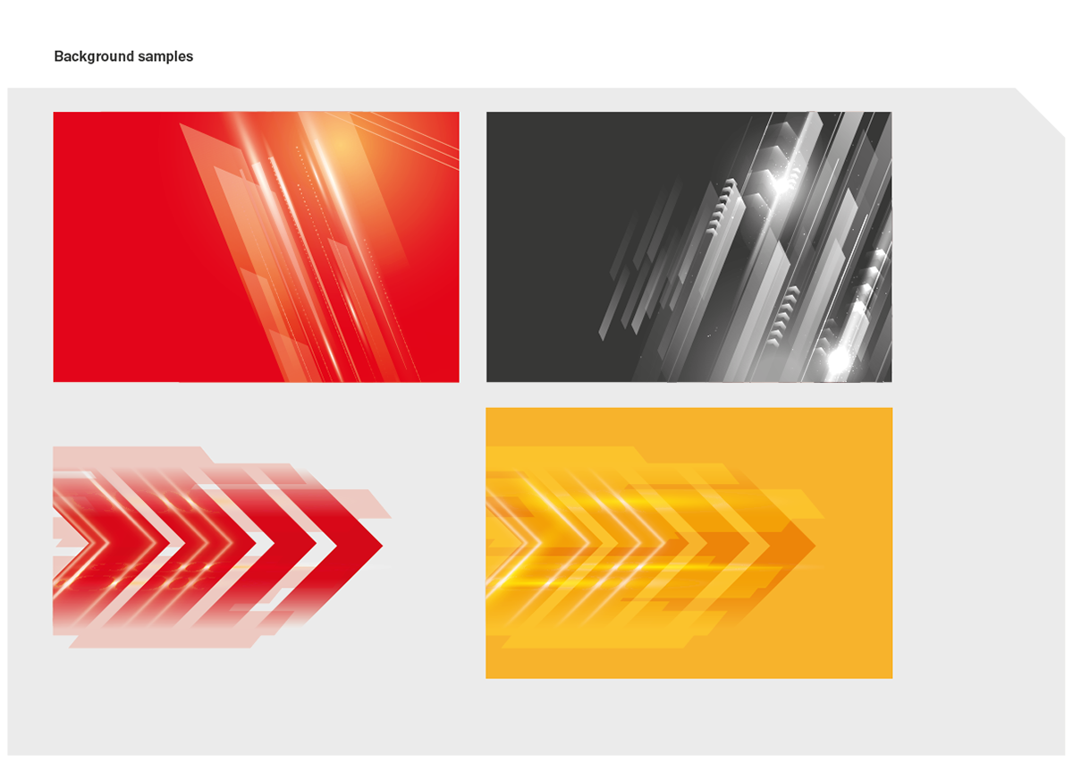
I developed a comprehensive Graphic Standards Manual to establish clear guidelines for the brand’s visual identity. This included:
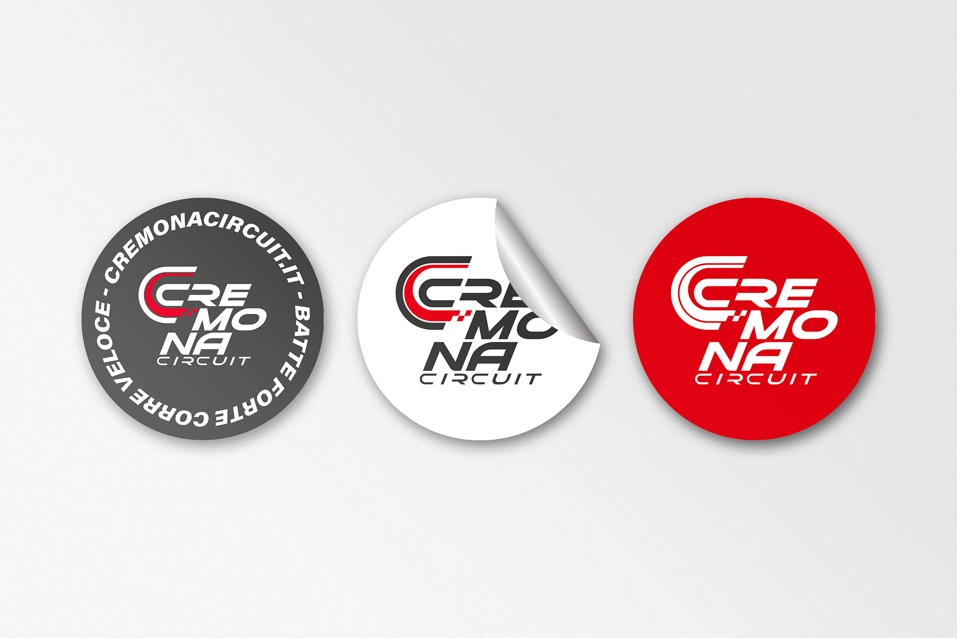
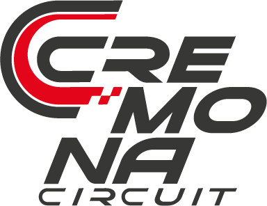
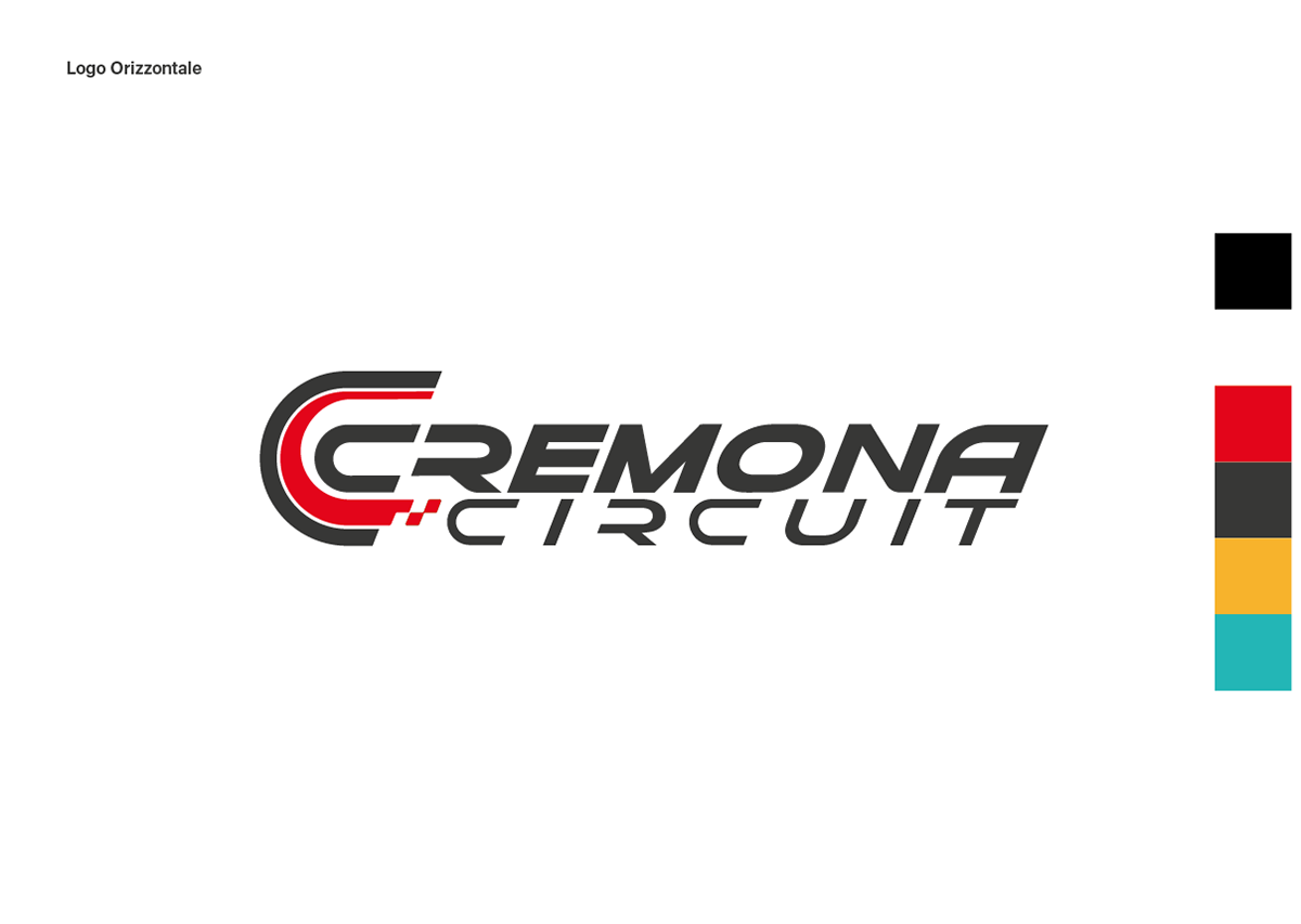
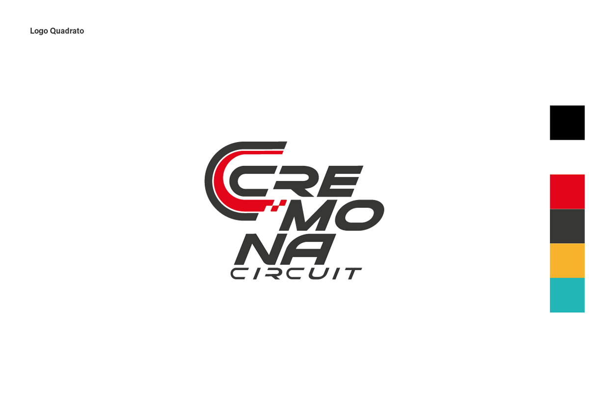
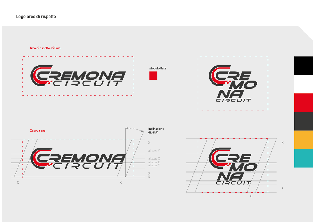
Logo and Variants: Defined appropriate usage scenarios for the primary logo and its variations.
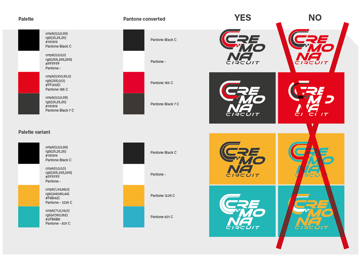
Color Palette: Established a consistent and dynamic color scheme to reflect the brand’s energy.
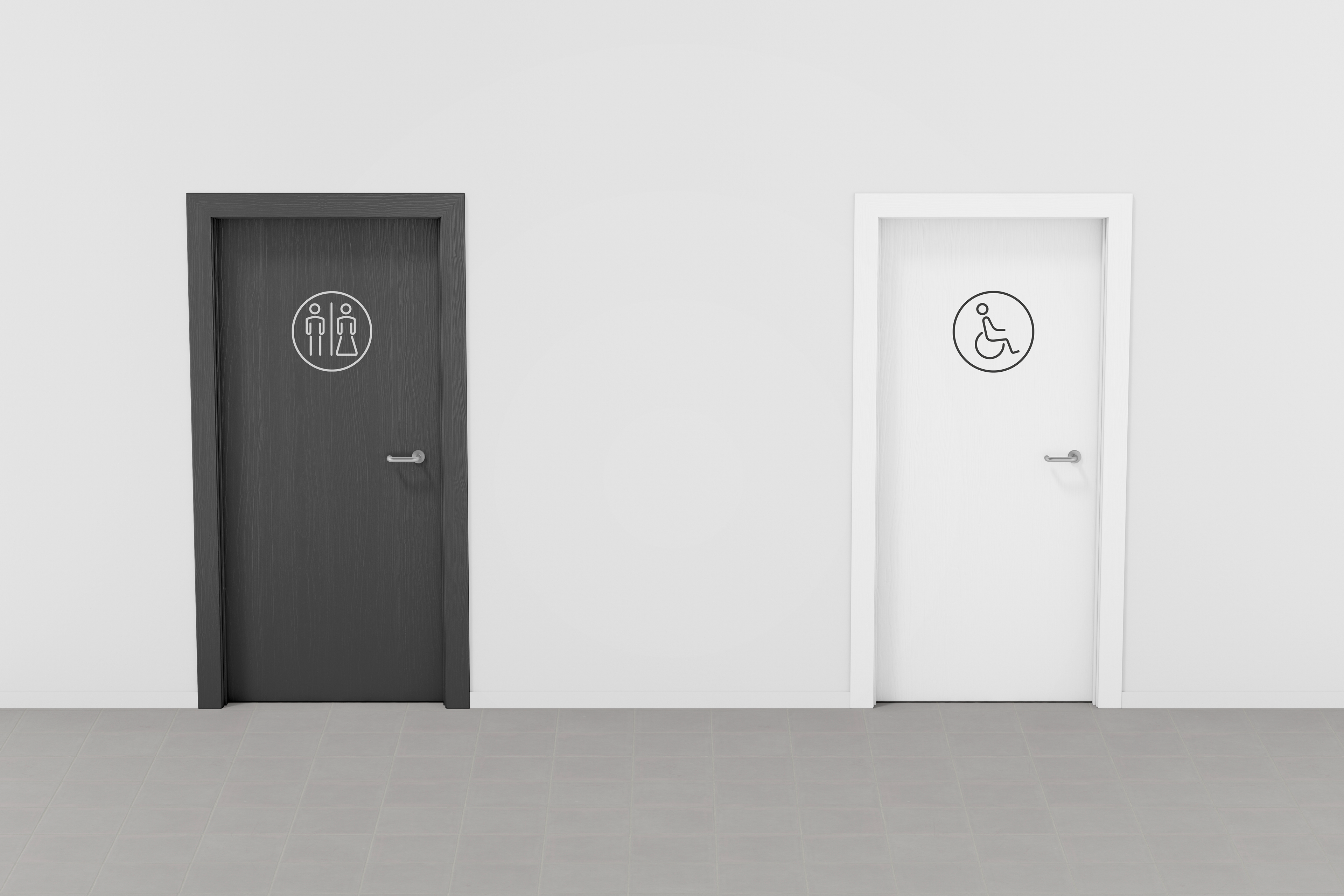
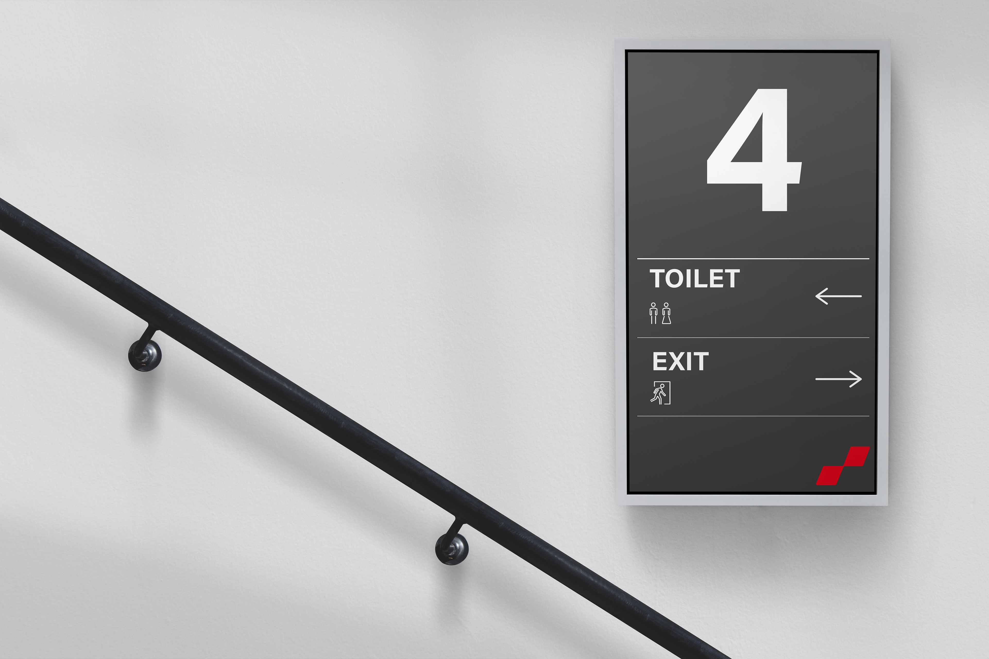
Iconography and Typography: Designed a cohesive set of icons and selected typography that conveys professionalism and modernity.
Usage Rules: Introduced principles to ensure brand consistency across all touchpoints.
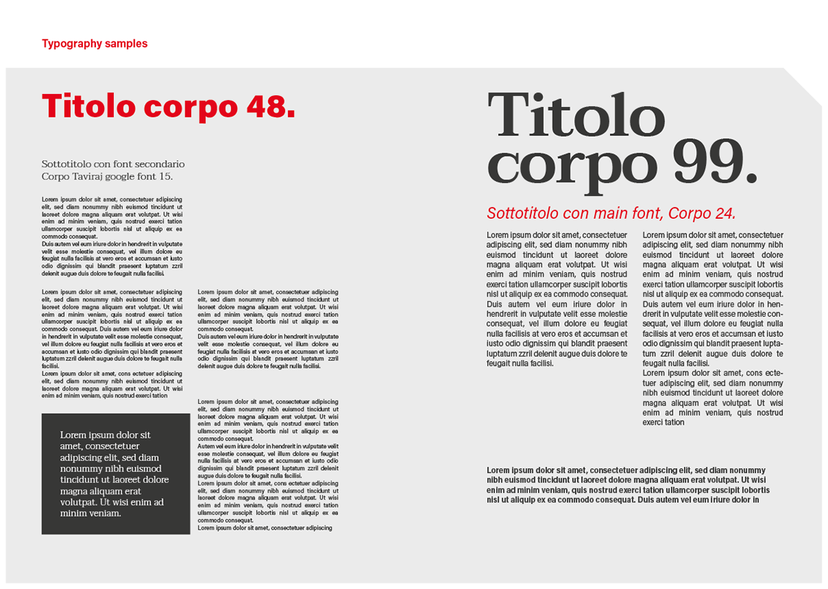
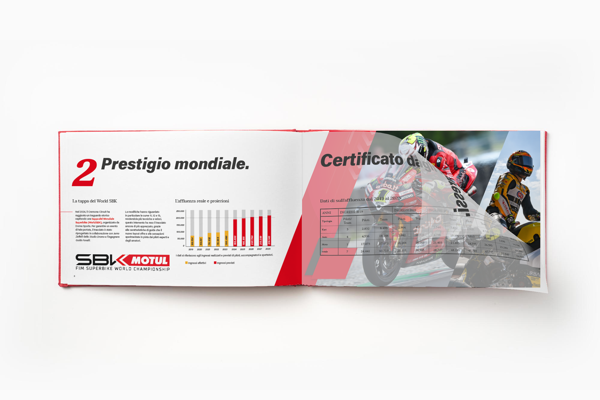
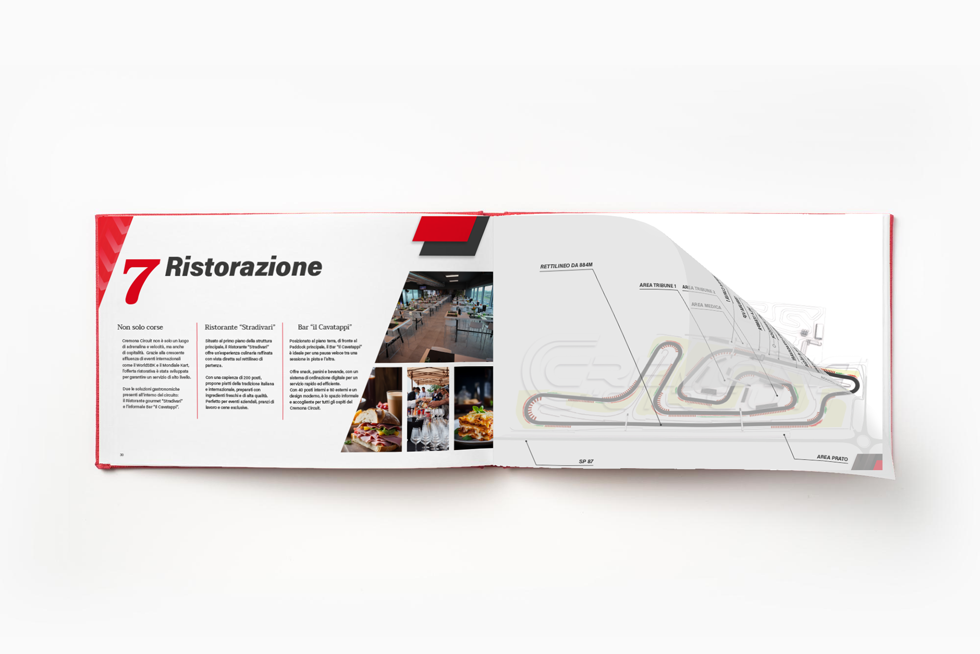
Some pages from the Brand guidelines manual
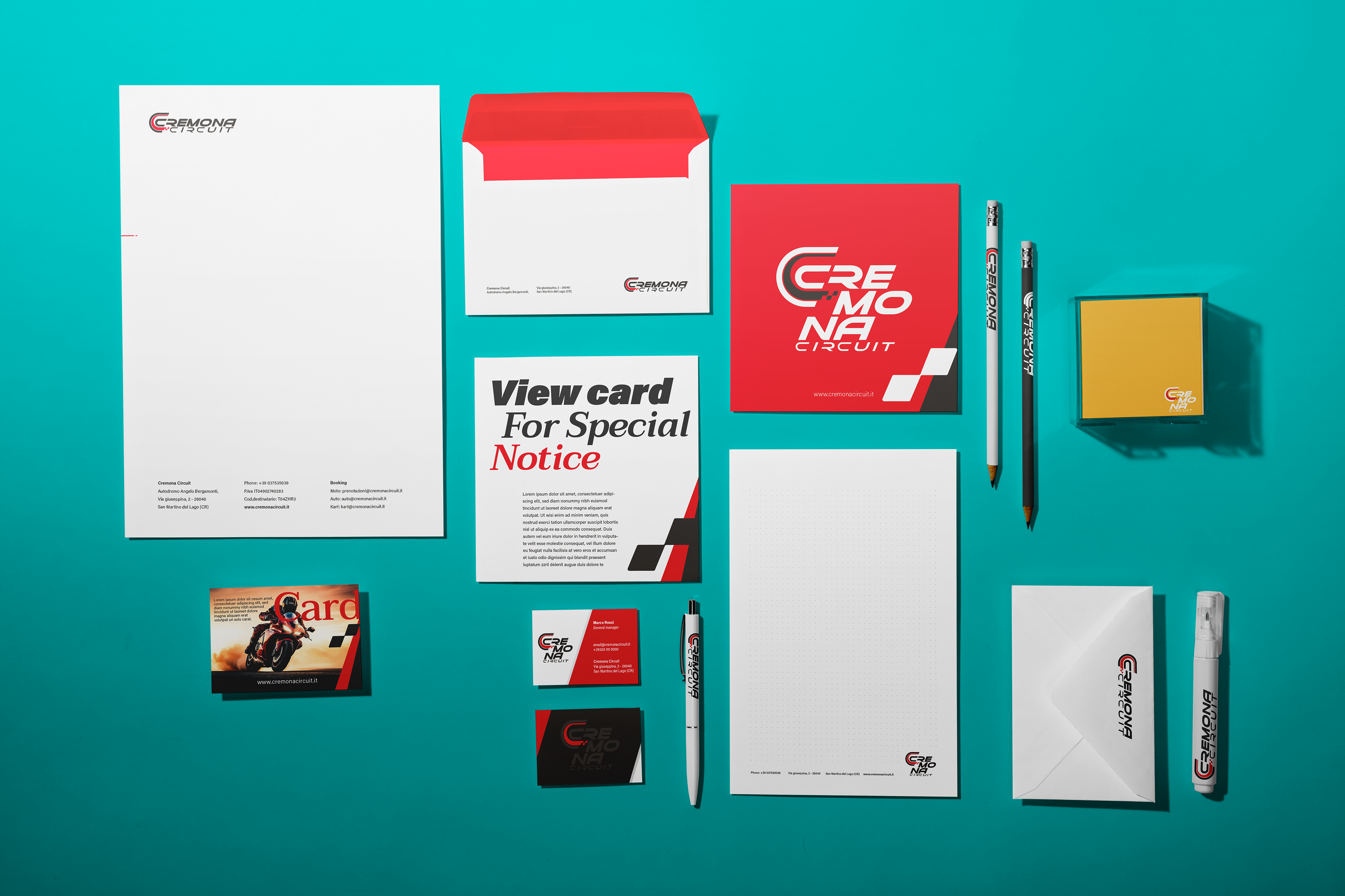
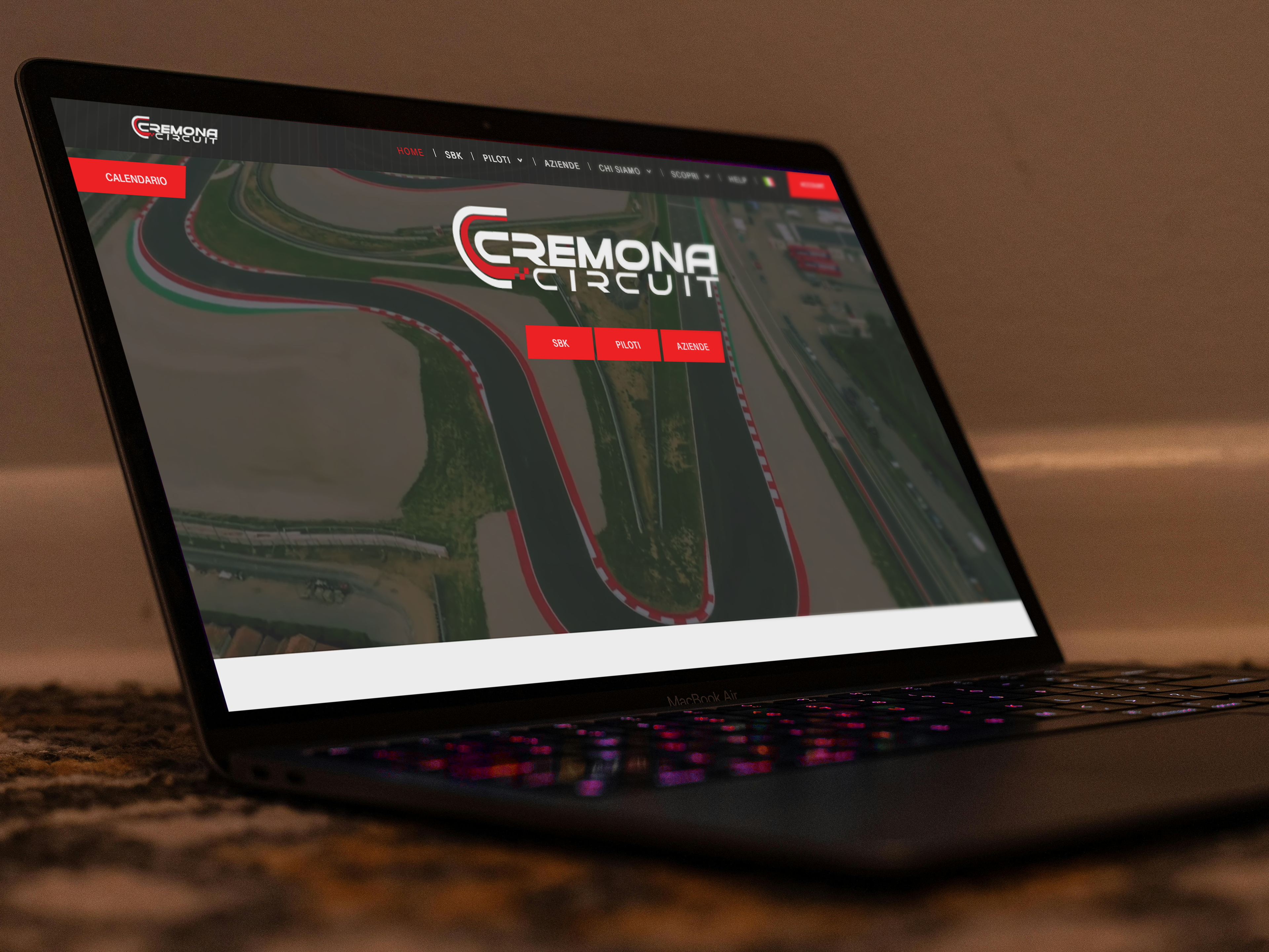
Cremona Circuit Visual Identity proposal
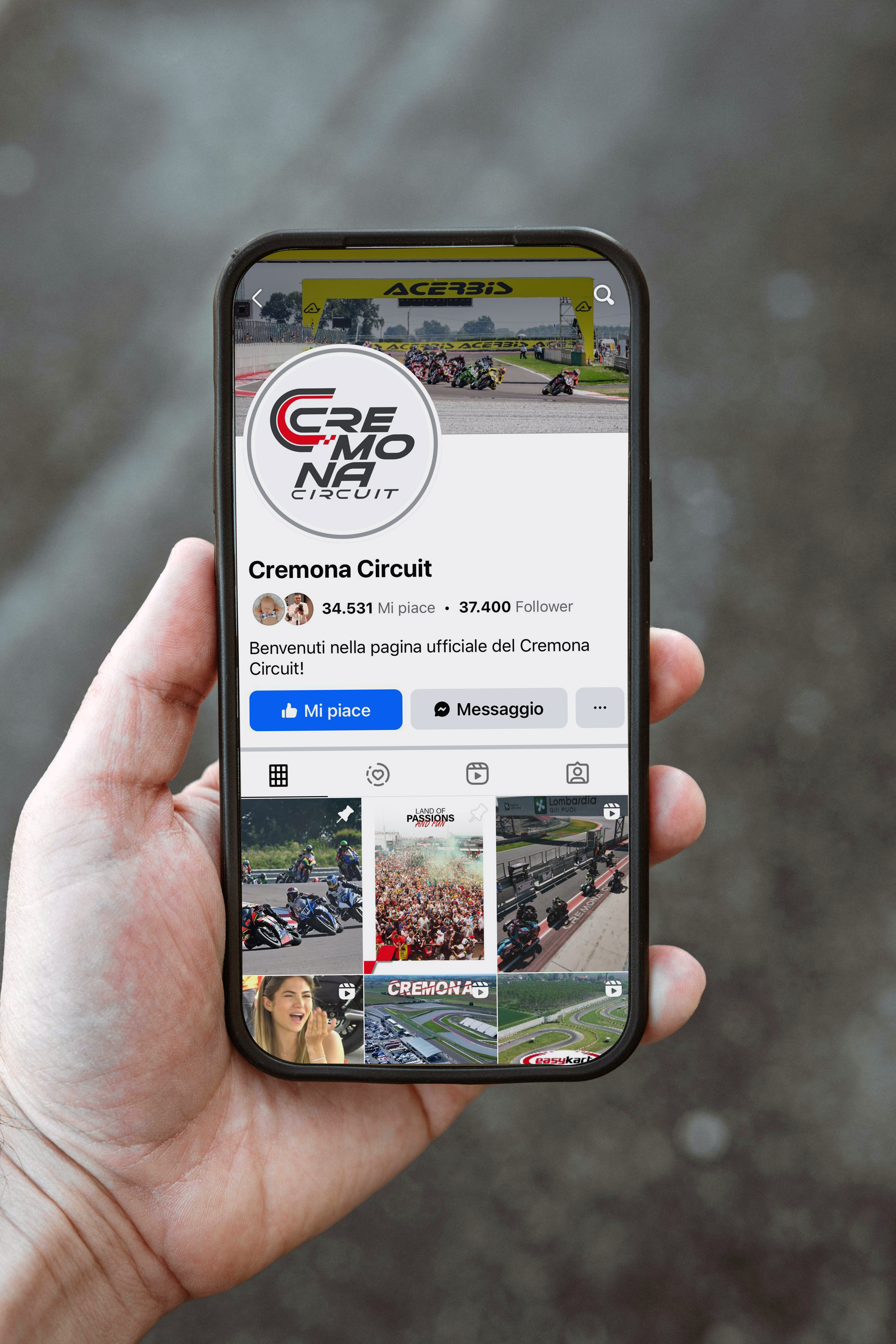
Coordinated Visual Identity
Building on the manual, I crafted a new coordinated visual identity for the Cremona Circuit. This included:
Corporate Design: Refreshed layouts for official documents, letterheads, and presentation templates.
Promotional Materials: Designed impactful posters and banners that align with the brand’s tone.
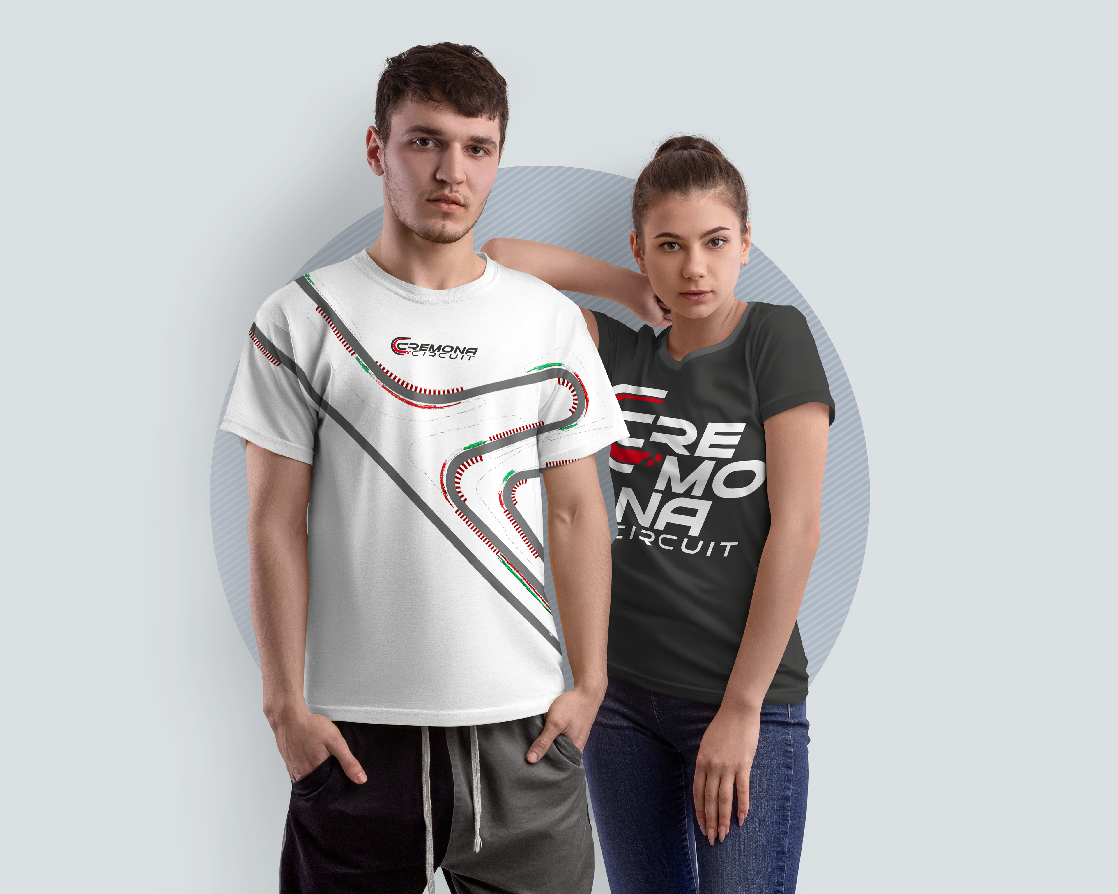
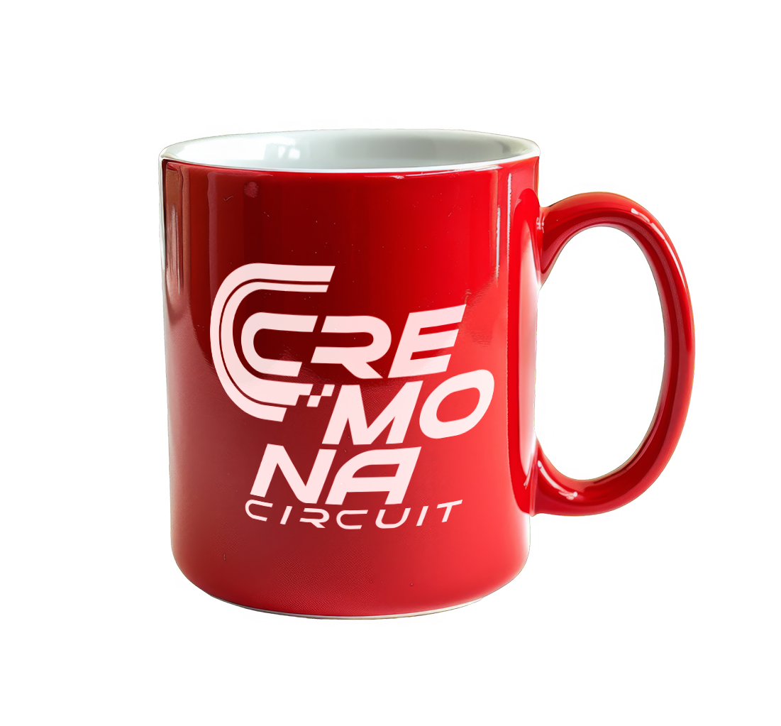
Merchandise and Gadgets: Created branded items that reflect the energy and passion of motorsport enthusiasts.