A visual identity inspired by the knitwear, created for a group of avant-garde editors and writers. This project demonstrates my ability to adapt a very specific graphic style, while maintaining a unique and distinctive aesthetic.
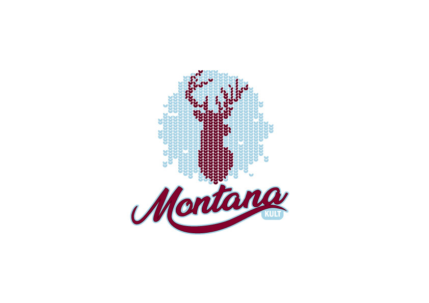
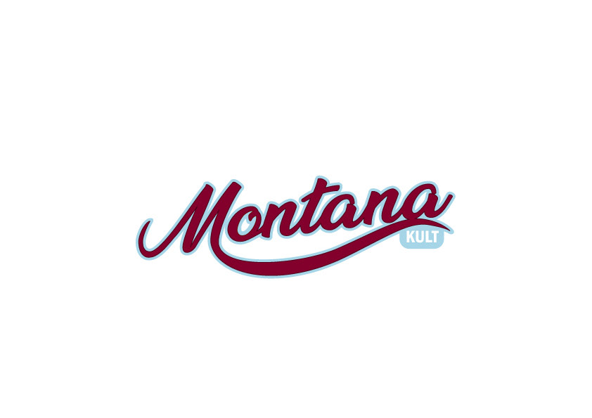
Montana Kult is a visual identity that I developed for a group of avant-garde editors and writers. The client's brief was very specific, requiring a graphic style reminiscent of knitting, with a specific color palette and graphic treatment. I accepted this challenge, creating a logo and visual identity that reflects the group's avant-garde nature, while maintaining a cohesive and recognizable aesthetic.
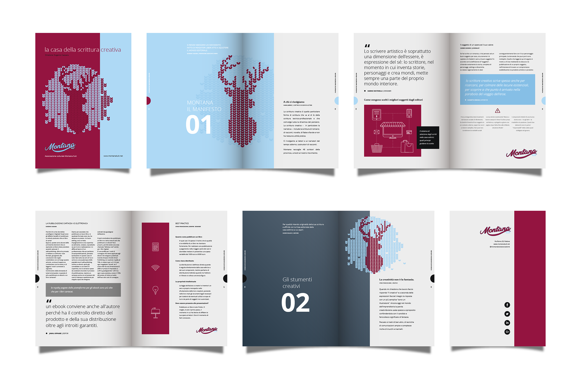
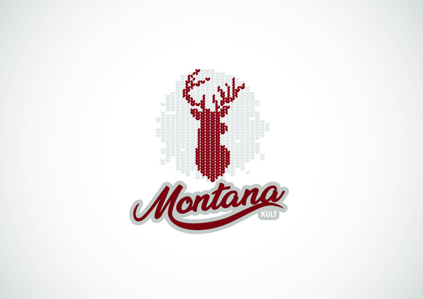
The Montana Kult project was an opportunity to explore the relationship between graphic design and weaving. The client wanted a logo that evoked the idea of hand-knitting, and I interpreted this request by creating a brand that looks like it came out of a ball of yarn. This approach allowed me to create a unique and distinctive visual identity that resonates with the group's aesthetic.
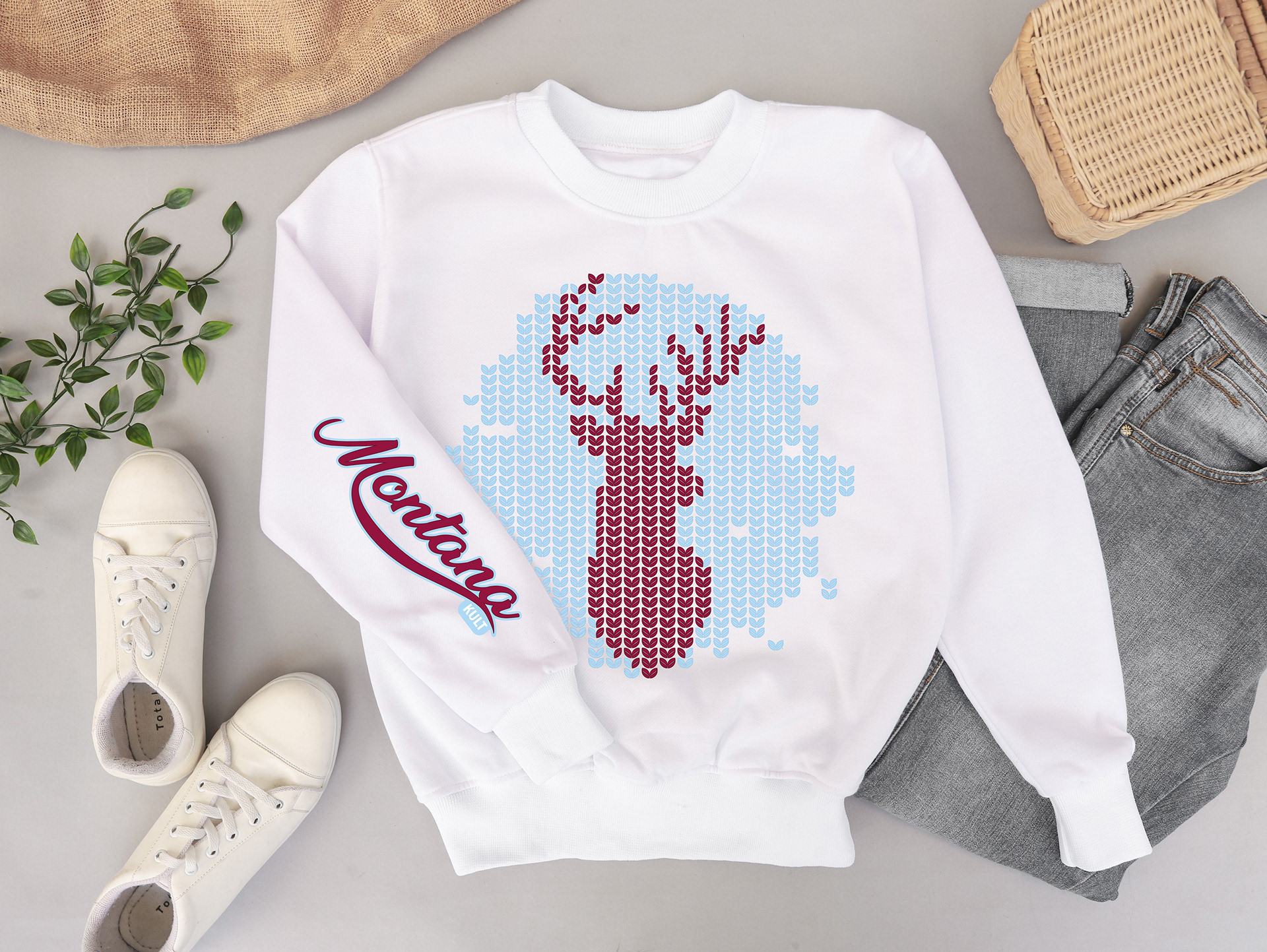
Color variants
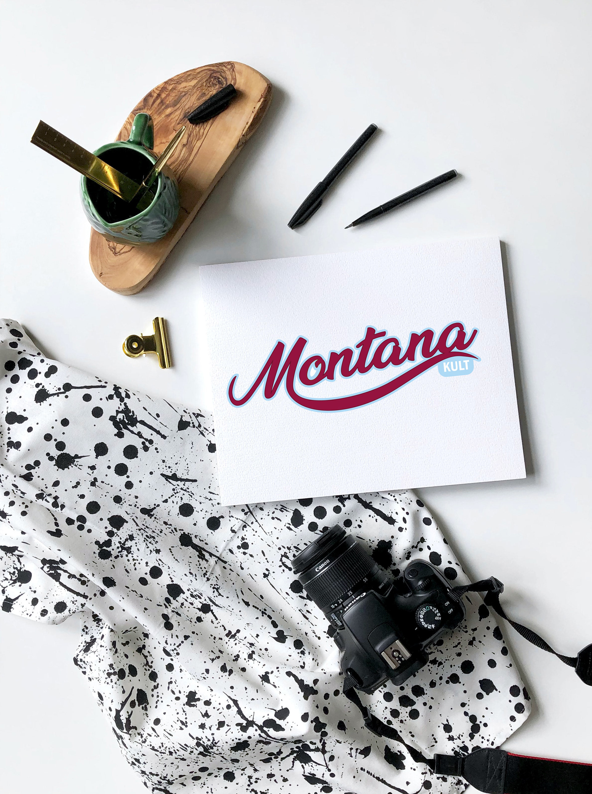
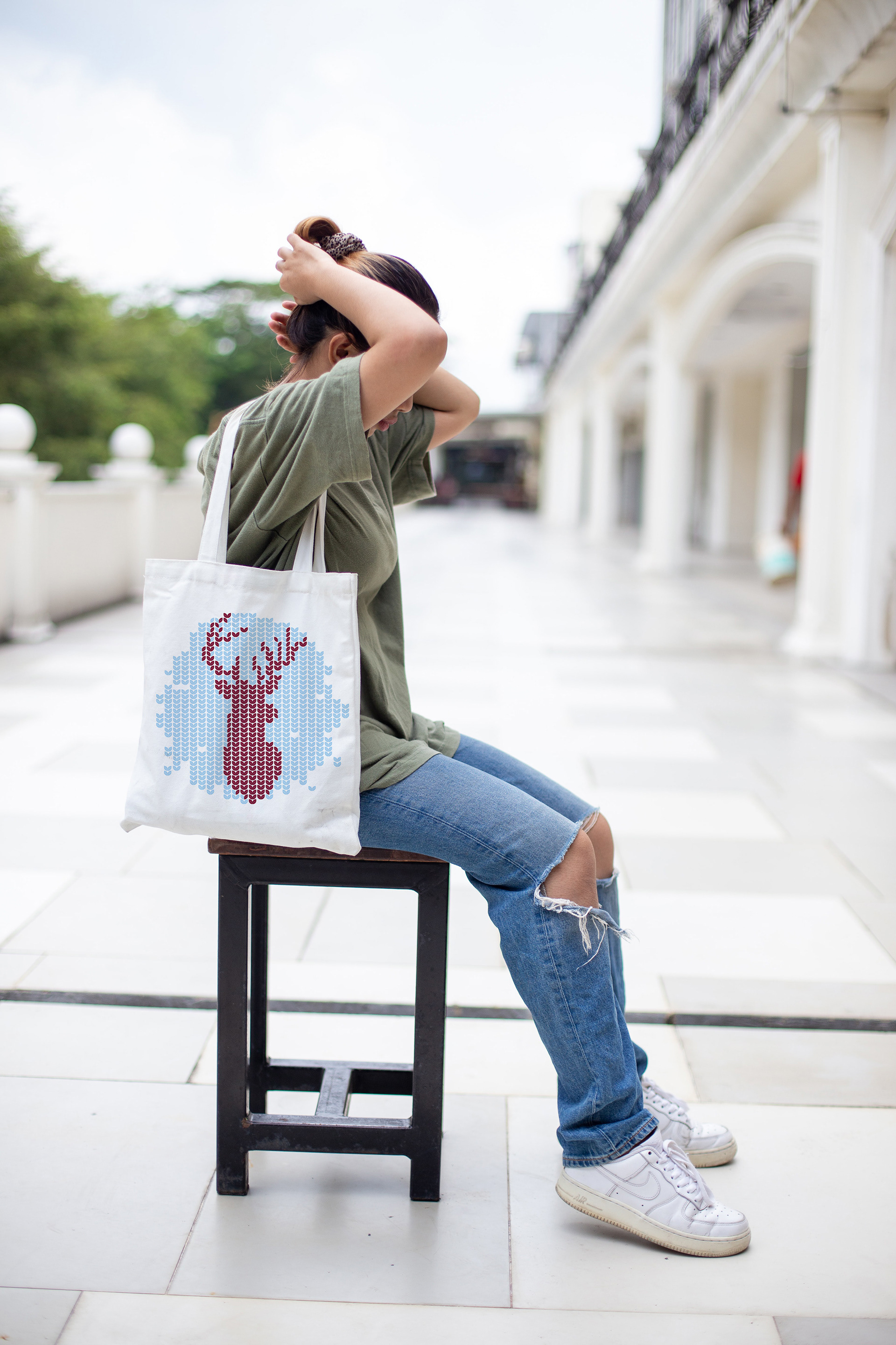
Mokup
The client's brief was very clear: a logo that evoked the idea of a hand-knitted sweater. I interpreted this request by creating a brand that looks like it came out of a ball of yarn, with intertwined lines and a warm, enveloping color palette.